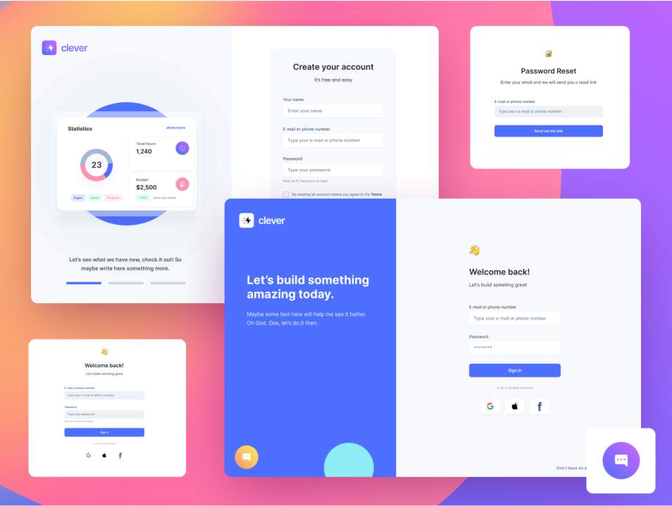
Dashboards are extremely useful and powerful tools that serve the purpose of displaying critical business information in a simple and effective way. They represent data with the help of excellent data visualization tools. This will make it very easy for business analysts to draw key information from the data. This is why admin and business dashboards are incredibly popular today.
Dashboards are not just tools that display relevant and actionable business data. They are also tools that help businesses to easily track KPIs and other metrics with ease. Dashboards make it possible for users to see the data in just a single glance.
Most businesses consider dashboards to be incredibly useful. This is mainly because these reporting tools transform different business data into critical information. That said, designing a dashboard is not an easy task, and it requires the implementation of different design practises in a smart way. Let us take a quick look on the emerging dashboard design trends that are here to stay.
Flat User Interfaces
Flat UI designs have become quite fundamental when it comes to offering a successful and engaging user experience. This is mainly because of the fact that FlatUi design provides a straightforward design approach. Flat UI design limits the use of gradient textures, shadows, and 3D treatments making the dashboard look aesthetically pleasing to users.
The use of two-dimensional illustrations in Flat UI design makes it incredibly easy for users to process the content easily without any sort of distractions. It is pretty evident that Flat UI design is here to stay and is going to be a dominating trend in 2021 and beyond.
Storytelling
It is important to realize that dashboards have evolved over the years. These powerful tools have been delivering critical business information to users ever since their launch. However, the way they communicate with end-users has changed. A storytelling approach is being used by most Dashboards now to make the communication with the end user simple and better.
The Color Factor
One of the growing problems in the field of dashboard design has to be the color issue. The use of color in dashboards is something that needs to be addressed. Some dashboards use too much color in their design, which makes it look visually overwhelming to the user.
On the other hand, several dashboard designers use less colors in a dashboard, which in turn makes it look less interesting or boring. It is best to find a balance between these two and use bright colors just to highlight key metrics, data, or insights that you want the users to instantly pick up.
Points To Consider When Designing A Dashboard
As we mentioned earlier, designing a dashboard can be quite hard and challenging. How, if you follow the best design practises and implement the latest design trends, you will be able to design an effective dashboard.
Understand User Requirements
The first and foremost thing you should do while designing a dashboard is to understand the requirements of users. You need to ask a few questions to yourself like “ What would be the primary goal of the dashboard, How can it benefit users/businesses, & How it can help businesses to make informed decisions.
It is evident that you will need to do thorough research if you want to build a useful dashboard. Proper research will give you a clear idea on what the target audience is after.
Choose A Dashboard
There are several types of dashboards available out there. So, the next thing you should do is to determine which type of dashboard is suitable for your project. The most common types of dashboards are analytical, strategical, tactical, and operational. It is best to learn about the difference of each one of these dashboards before selecting one. Use Internal Blog Links With UTM If Possible)
Opt For a Minimal & Simple Design
Cognitive psychology states that human brains lack the ability to handle vast amounts of data or information. This is why it is best to stick with a simple design. Dashboards with several graphs, charts, and other data visualizations may overwhelm customers. As a result, they won’t be able to easily find what they are looking for. Fortunately, you will be able to avoid such hassles by opting for a simple Dashboard design.